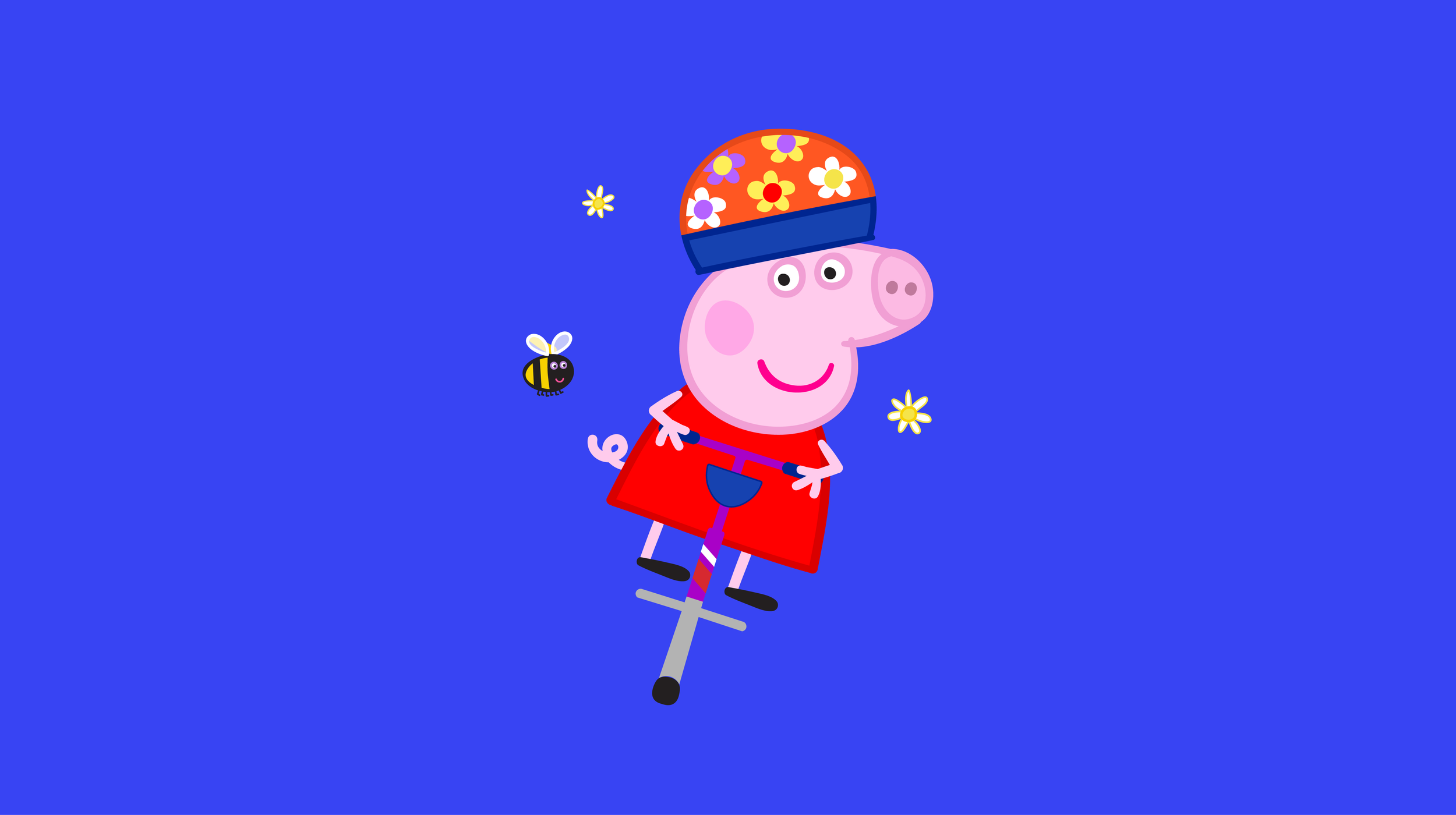
Peppa Pig, my favorite cheeky little piggy.
At the start of 2024, I was assigned to the Peppa Pig brand refresh project at FutureBrand. I'll be honest—when I first heard about it, I felt a bit of dread. But looking back, it's turned out to be my favorite project so far in my time here. The challenge was to modernize and refresh the Peppa Pig brand without making any changes to the beloved characters themselves.
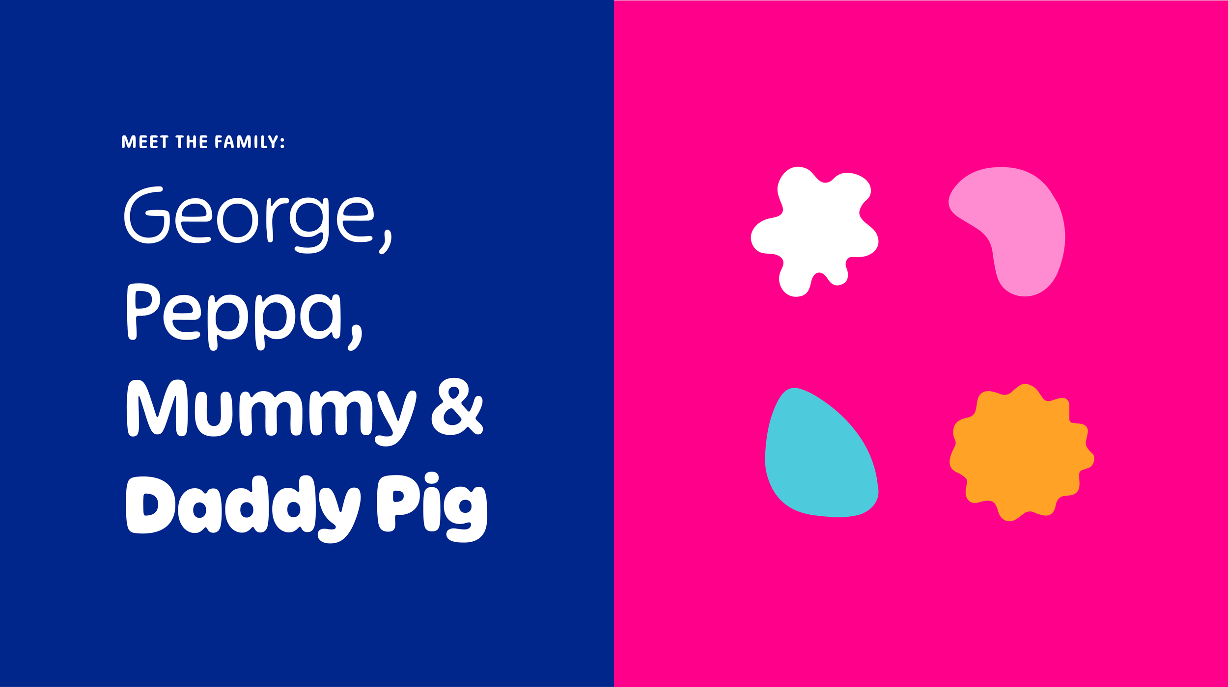
We began by exploring which elements of the brand we could evolve. After a few rounds of exploration, it became clear that color and typography would be our main tools for bringing a more youthful and contemporary feel to the brand.
The process started with reimagining the logo. We focused on creating better color contrast while maximizing the impact of Peppa’s iconic face and her name. Next, we developed a playful and versatile logo suite that would work across different touchpoints. To round out the toolkit, we selected a new typeface that maintained the brand's fun, friendly personality, and introduced a series of organic shapes—think muddy puddles—that complemented Peppa's playful spirit.
Once the foundational elements were set, we moved on to designing a few merchandise items that would bring Peppa’s cheeky personality to life in a new, dynamic way. These items were crafted to be not just fun for little ones but also visually appealing for older fans, ensuring Peppa's charm could be enjoyed by all generations.
The result is not just a refreshed brand toolkit, but a colorful, engaging brand expression that feels more intentional and thoughtfully designed. It truly captures everything Peppa stands for—playful, fun, and full of personality.
What: Brand refresh |Agency: FutureBrand |Creative Direction: Mattias Mackler |Animation: Dany Vo